Little black
Book

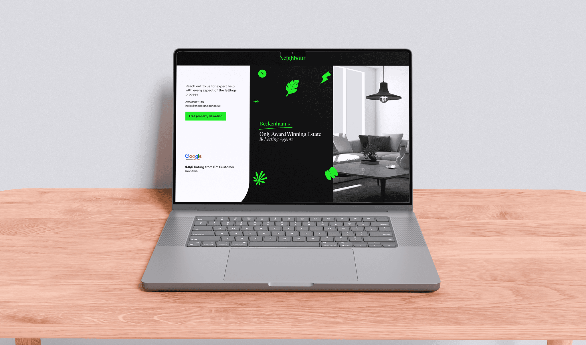
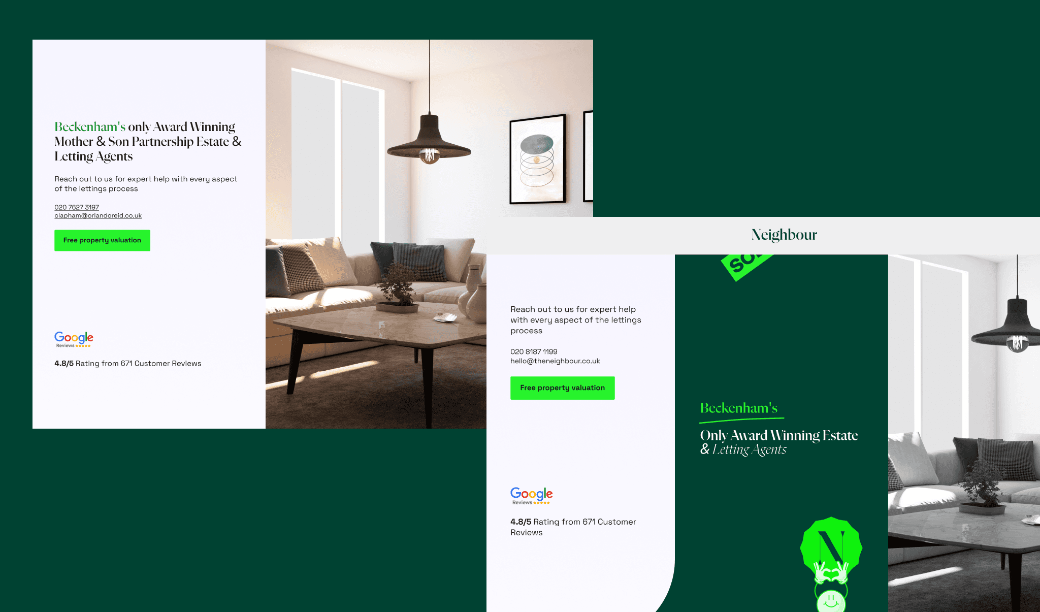
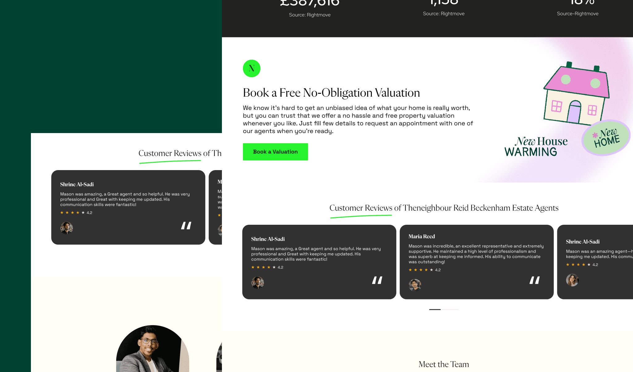
The Neighbour, a UK-based real estate agency, needed a bold, modern website that reflects their motto: "They Think Different." We redesigned their site with vibrant visuals, dynamic UI, and a perfect balance of professionalism and funkiness, creating a standout brand identity in the market.
client
role
time line
live project
The Ask
The Neighbour, a UK-based real estate agency, wanted a complete website redesign that reflects their unique motto: "They Think Different." Their existing site lacked a funky, modern identity, and they needed a brand revamp that balanced professionalism with creativity to stand out in the market.
The Design
The Problem: The old website had a generic layout, failing to capture The Neighbour’s bold personality. It lacked a modern, engaging aesthetic that could appeal to their audience.
The Solution: We introduced a funky, vibrant design while maintaining a professional real estate feel.
✅ Bold Colors & Unique Typography – A fresh, eye-catching look.
✅ Dynamic UI Elements – Smooth animations for an interactive experience.
✅ Professional Yet Playful Branding – A blend of trust and creativity.
The Neighbour: Redefining Real Estate with Bold & Funky Design
the development
We built a fully responsive, visually striking website that delivers both modern aesthetics and smooth functionality. The site now represents The Neighbour’s bold brand identity, ensuring a memorable user experience.
the takeaway
The new website successfully merges funky creativity with real estate professionalism, reinforcing The Neighbour’s identity as a one-of-a-kind agency in the UK market.